📝Confidentiality note: This project was developed for a client, so certain details related to branding and implementation are not publicly disclosed. If you’d like to learn more about the process, decisions, or outcomes, I’d be happy to share more in conversation.
Overview
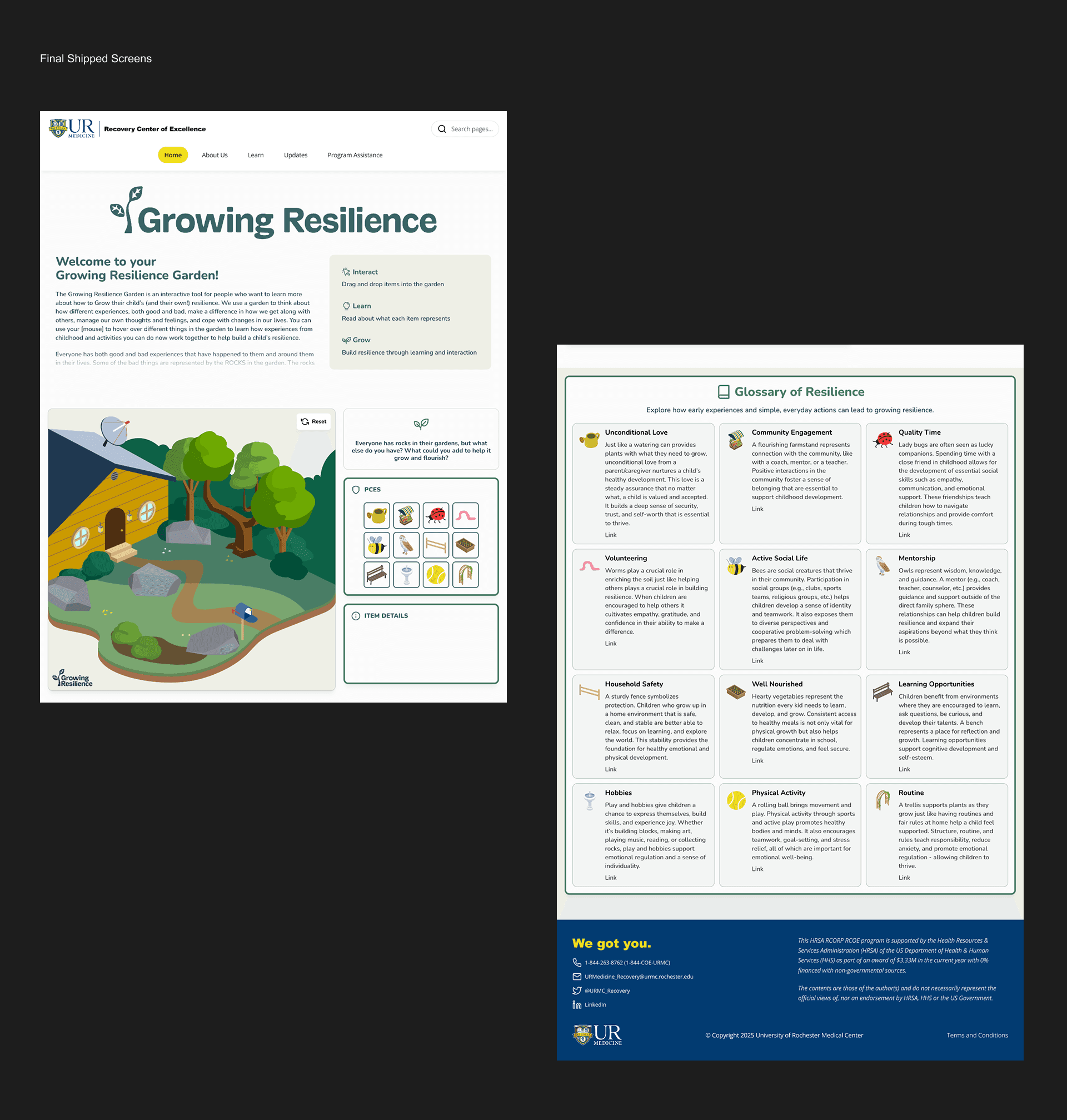
Growing Resilience is an interactive educational tool designed for the University of Rochester Medical Center’s Recovery Center of Excellence. The experience translates complex public health research on Adverse Childhood Experiences (ACEs) and Positive Childhood Experiences (PCEs) into an approachable digital format for families. I led the design of a gamified, drag-and-drop digital garden that allows users to actively build environments that support children’s wellbeing. Each object placed in the garden represents a resilience-building activity, environment, or relationship, helping families understand how everyday actions contribute to long-term health outcomes.
The project focused on transforming dense research into an engaging, behavior-driven learning experience that works effectively for rural communities, where mobile access and attention constraints are critical considerations.
Live Prototype
Impact
Growing Resilience is part of URMC's Recovery Center of Excellence — a federally funded public health program supported by a $3.33M HRSA grant from the US Department of Health and Human Services. The tool was designed to serve rural families and caregivers, a population historically underserved by clinical health education. Before this project, no interactive digital experience existed to translate URMC's childhood resilience research into something families could actually engage with outside a clinical setting.
My Role
Lead UX Designer — Research, Strategy, Interaction Design, UI
Target Audience🎯
Designed for rural families and caregivers, many of whom are accessing content on mobile devices with limited time and familiarity with clinical terminology.
The experience prioritizes simplicity, clarity, and low-effort interaction, making resilience concepts easy to understand and apply in everyday life.
The Challenge 💡
Research on ACEs and childhood resilience is typically communicated through reports, clinical frameworks, or long-form educational materials designed for healthcare professionals.
For families, especially in rural communities, these resources present key barriers:
• Information overload – long, text-heavy explanations are difficult to engage with in day-to-day life
• Low retention – passive reading rarely translates into real behavioral change
• Limited access and attention – users often rely on mobile devices, have limited time, and may not engage with complex or unfamiliar digital interactions
The challenge was not just to simplify the content, but to translate it into an experience that feels natural, low-effort, and easy to engage with, while still maintaining the credibility of a medical institution.
Product Strategy 🔮
Rather than presenting resilience as a list of recommendations, we reframed the experience around participatory learning.
The central concept became a digital resilience garden, where users actively construct environments that support child development.
This metaphor helped achieve three goals:
• Make abstract concepts tangible
• Encourage exploration instead of passive reading
• Create emotional engagement through visual storytelling
Each object in the garden represented a PCE category such as emotional safety, supportive relationships, learning opportunities, or community belonging.
Design Process 🚀
Exploring the garden metaphor
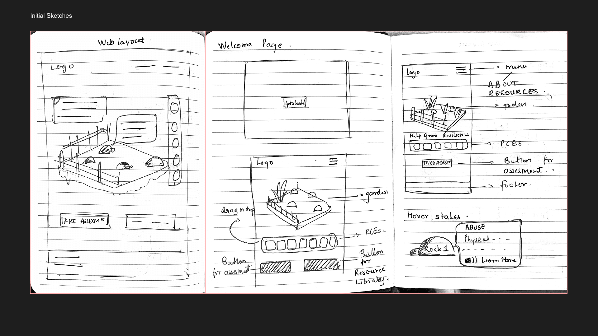
We began by expanding on the client’s garden idea, exploring multiple UI styles and visual directions. I sketched different layouts for how the garden could look—whether lush and playful, minimal and symbolic, or somewhere in between. The challenge was to find the right balance between warmth and credibility, keeping the experience family-friendly without losing its connection to a medical institution.
Wire-framing
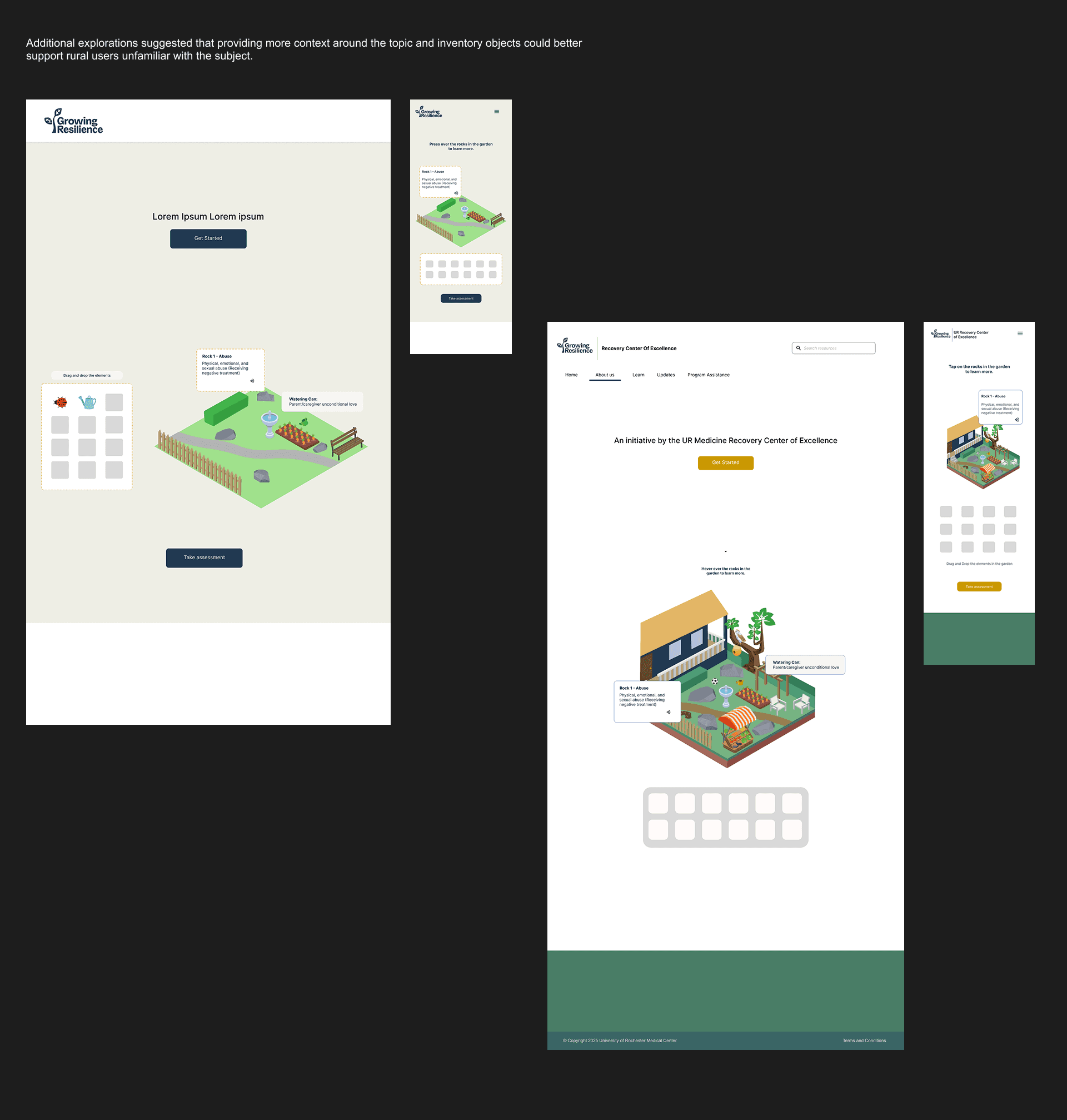
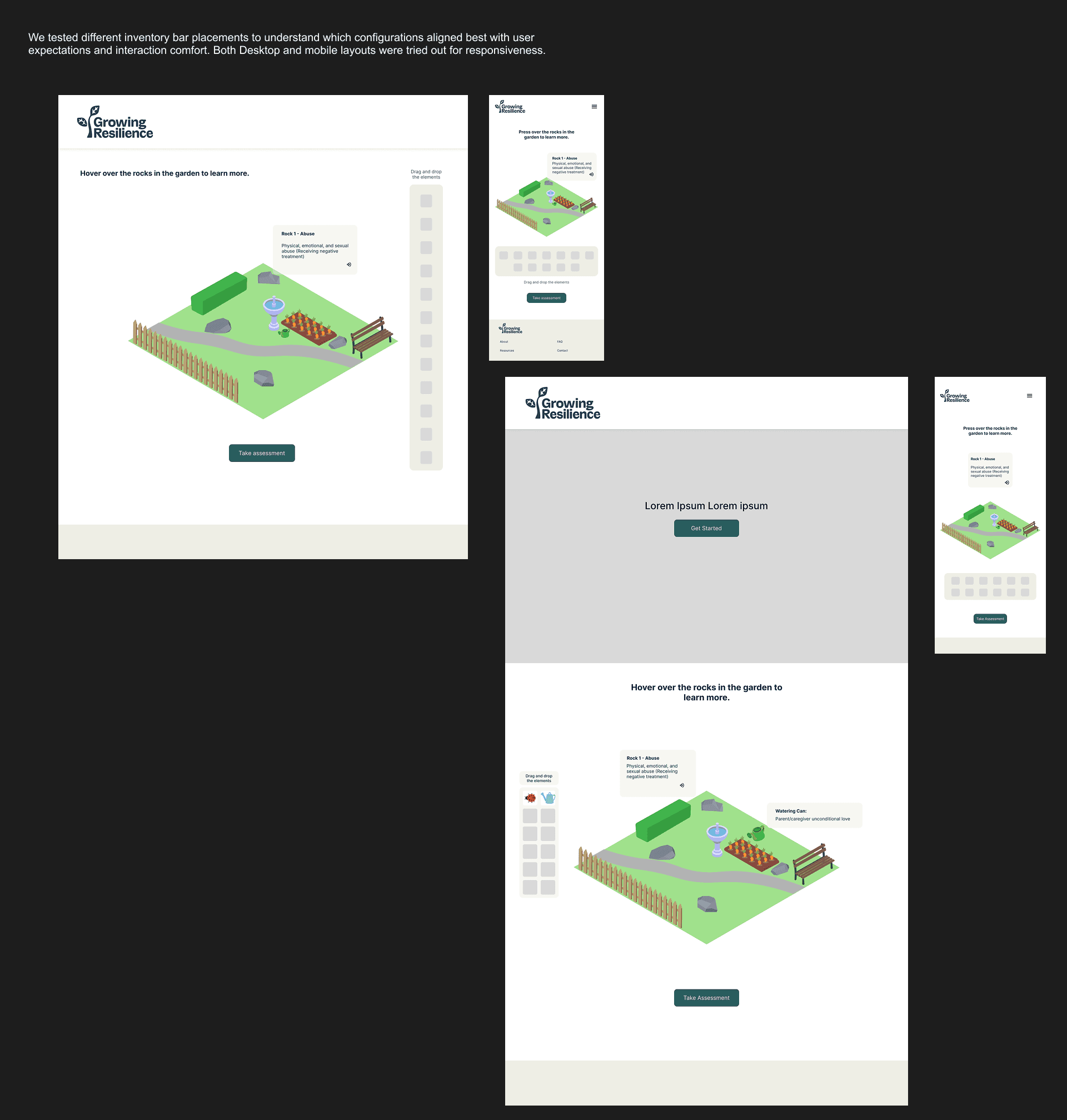
Once the concept was aligned, we created low-fidelity wireframes to map the user flow. The design was structured around an inventory bar from which users could pick items (trees, plants, tools, etc.) and place them into their garden. Each placement triggered a short educational pop-up, linking the action to a PCE theme such as emotional support, learning opportunities, or community connection.
Initial layout explorations highlighted the importance of simplifying navigation and rethinking content structure to transform complex topics into an interactive, user-friendly experience for rural audiences.
Final Outcome
Design Impact
Guided onboarding for clarity
Introduced a lightweight onboarding panel to help users quickly understand how to interact with the experience, reducing initial confusion and cognitive load.
From information to interaction
Reframed dense educational content into a participatory experience, allowing users to actively build a garden and learn resilience concepts through doing rather than reading.
Intuitive drag-and-drop system
Designed an inventory-based interaction model that feels familiar and easy to use, especially for mobile-first users.
Learning through immediate feedback
Connected each user action to contextual learning, where placing an object reveals its meaning, improving engagement and retention.
Mobile-first by default
Optimized layouts, spacing, and touch targets for smaller screens, ensuring accessibility for rural audiences who primarily rely on mobile devices.
Progressive disclosure of content
Separated core interaction from deeper educational content, allowing users to explore at their own pace without feeling overwhelmed.
Supporting deeper learning with a glossary
Introduced a structured glossary as a secondary layer for users who want to explore concepts in more depth without interrupting the main experience.
Balancing trust with approachability
Combined a clean, structured layout with warm, nature-inspired visuals to maintain medical credibility while staying engaging for families.
Designed for behavior change
Focused on making resilience concepts actionable and memorable, moving beyond awareness to encourage real-world application
Main Interaction Design ❇️
The core interaction model centers around drag-and-drop garden building.
Users select items from an inventory and place them into their garden. Each action triggers contextual learning cards that explain the resilience principle behind the object.
This interaction design shifts the experience from reading about resilience → actively building it.
Key design considerations included:
• Large touch targets for mobile usability
• Immediate feedback and micro-interactions
• Short, digestible educational prompts
• Progressive exploration rather than overwhelming information
Drag-and-Drop action
The prototype allowed us to validate:
• drag-and-drop mechanics
• touch interactions on mobile devices
• animation feedback for object placement
• clarity of learning prompts
Visual design system
The visual language balances approachability and credibility.
To achieve this, we developed a design system that combined:
• nature-inspired illustrations reflecting the garden metaphor
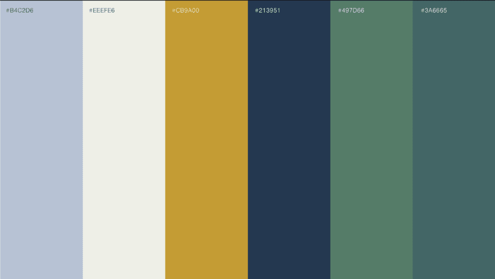
• accessible color palettes aligned with URMC branding
• clear visual hierarchy for educational prompts
• consistent iconography and object design
Each garden object was custom illustrated to maintain stylistic consistency while remaining culturally neutral and broadly relatable.
Key Features ⚡️
• Interactive drag-and-drop garden building
• Contextual learning prompts tied to resilience concepts
• Mobile-first interaction design
• Custom illustration system
• Seamless integration with URMC brand standards
Room to Bloom🌻
As a designer, my biggest reflection on this project is cohesion. The interactive garden experience achieved exactly what we set out to — warm, engaging, and approachable. But the surrounding website experience remained constrained by institutional design conventions, creating a jarring tonal shift between the two. If I returned to this project with full creative freedom, I would extend the garden's visual language — its warmth, illustration style, and nature-inspired palette — across the entire experience, so families never feel like they've stepped back into a clinical environment. Good health education shouldn't feel like a government form
Outcome 🏆
The final shipped experience covers 12 Positive Childhood Experience categories — each translated from dense clinical research into interactive, family-friendly content. The prototype was successfully handed off to URMC and published under their official Recovery Center of Excellence platform. The client responded with strong positive feedback, noting the interaction design exceeded their expectations. Growing Resilience marked the first time URMC's childhood resilience research was made accessible to everyday families through an interactive digital format — moving public health education out of clinical reports and into people's hands.

