URMC Recovery Platform Redesign | Client Work
URMC Recovery Platform Redesign | Client Work
Date
Date
June 2025 - Aug 2025
June 2025 - Aug 2025
Role
Role
UX, UI, Interaction Design, Stakeholder Alignment
UX, UI, Interaction Design, Stakeholder Alignment
Scope
Scope
URMC Recovery Center of Excellence via MAGIC Spell Studios
URMC Recovery Center of Excellence via MAGIC Spell Studios
View Live Site
📝 Confidentiality note: Due to the nature of this client project, detailed process artifacts are not publicly shared. This case study focuses on final outcomes and key design decisions.
Overview
Redesigned a large-scale healthcare platform for the University of Rochester Medical Center’s Recovery Center of Excellence, with a focus on improving accessibility, simplifying navigation, and making recovery resources easier to find and understand.
The project addressed challenges around fragmented content, complex navigation, and low content discoverability, particularly for rural users accessing the platform on mobile device.
Impact
Redesigned a federally funded healthcare platform — supported by a $3.33M HRSA grant — serving rural communities across New York State, a population historically underserved by accessible health information. The existing platform had grown to 200+ pages of fragmented, hard-to-navigate content with no consistent design system holding it together. This redesign was built to change that.
My Role
Lead Product Designer — UX/UI, Interaction Design, Design Systems
I led the end-to-end design of the platform in Figma — owning UX, UI, information architecture, and the design system. I worked alongside a co-designer who handled front-end implementation in Framer, collaborating closely to ensure the design translated accurately from concept to shipped product.
Target Audience
Rural individuals, families, and caregivers seeking recovery-related resources, often accessing the platform via mobile devices with limited time and familiarity with complex healthcare content.
What wasn't working? — Key Observations
Representative examples highlighting key usability and structural challenges across the platform.
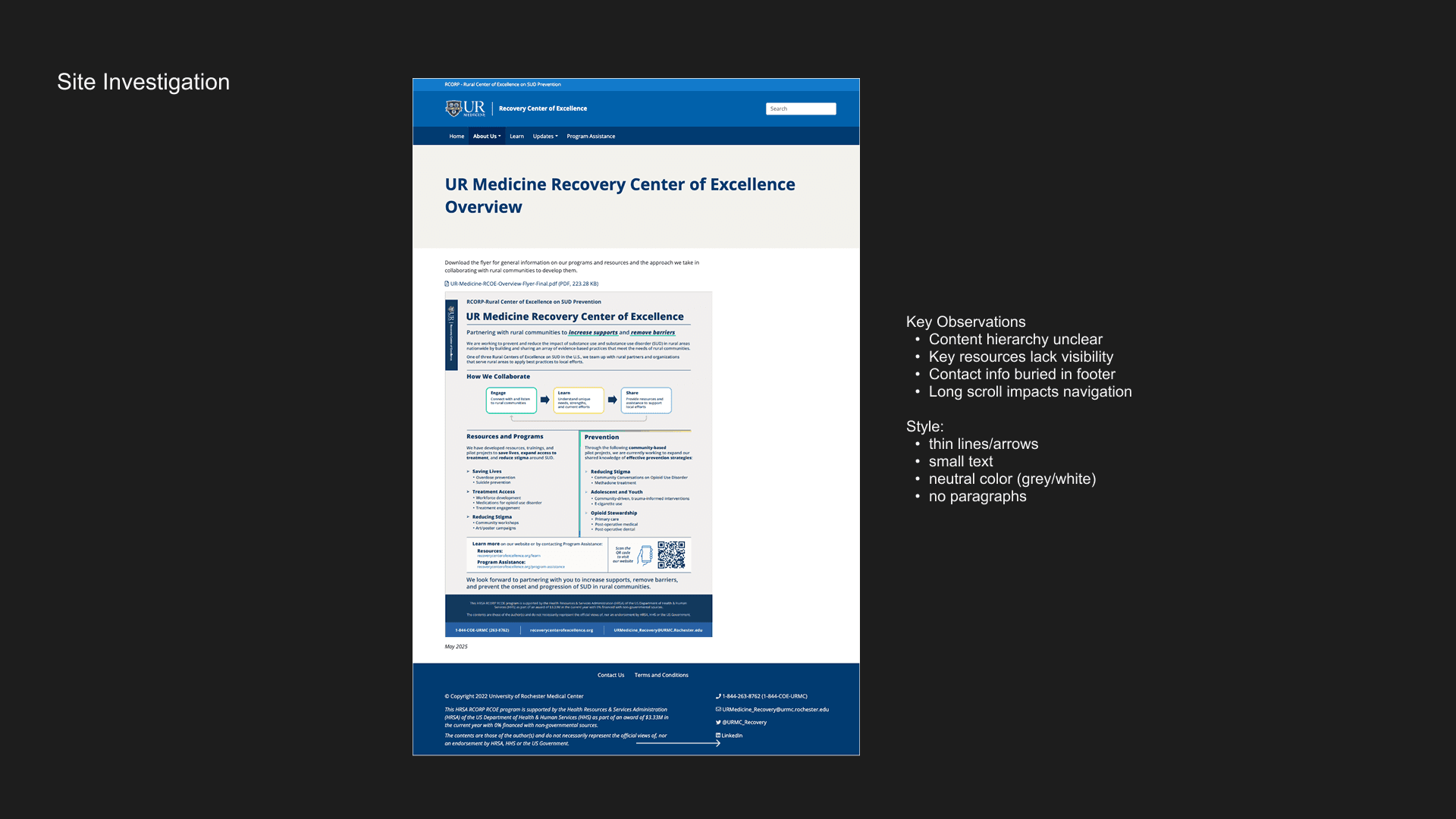
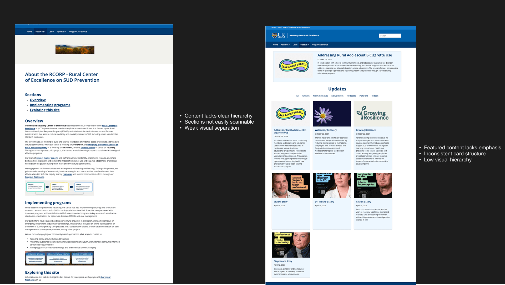
Similar patterns were observed across the whole site
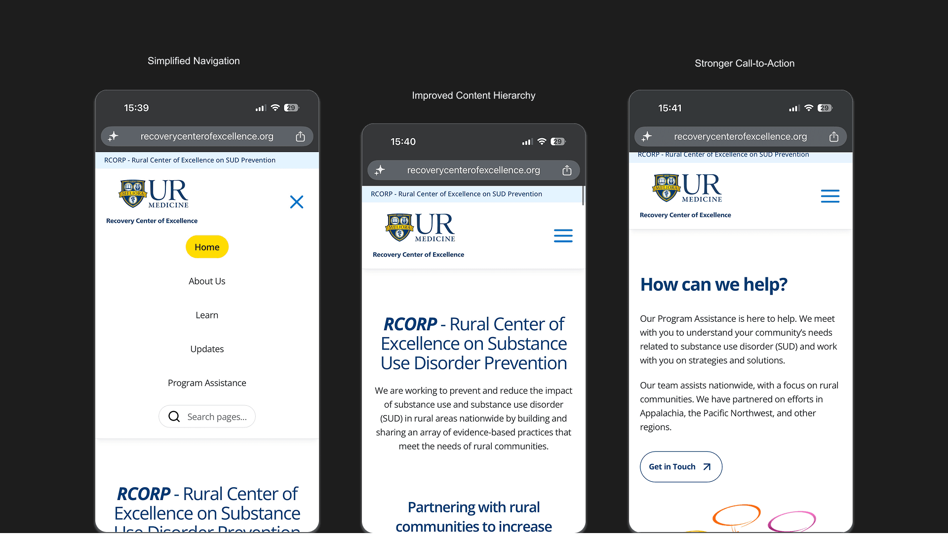
Lack of Clear Content Hierarchy
Content appeared as continuous blocks with minimal visual separation, making it difficult for users to scan and prioritize information.
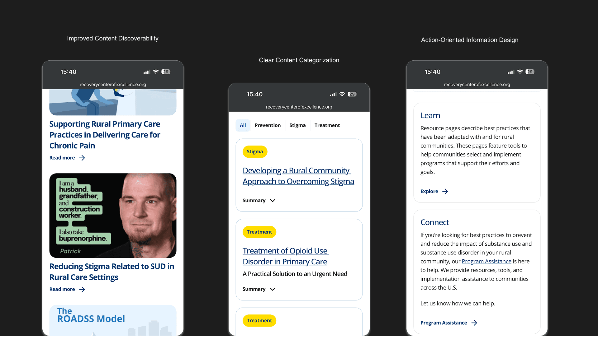
Low Content Discoverability
Key resources and featured content were not visually distinguished, reducing visibility and engagement.
Inconsistent Layout Patterns
Different sections and cards followed varying structures, leading to reduced predictability and usability.
Limited Visual Emphasis
Important content did not stand out, making it harder for users to identify priority information.
Inefficient Scanning Experience
Text-heavy sections and weak grouping increased cognitive load, especially for users quickly browsing on mobile.
Design Direction
To align on the right visual and interaction approach, we explored multiple design directions with stakeholders, focusing on balancing approachability, clarity, and credibility.
The goal was not just visual refinement, but defining a direction that could scale across a complex, content-heavy system.
Each direction evaluated how the experience could:
• Simplify complex healthcare content
• Improve scannability and navigation
• Maintain trust and alignment with a medical institution
• Feel approachable for non-clinical users
The selected direction was refined to ensure consistency across the platform while supporting both content-heavy pages and interactive elements.
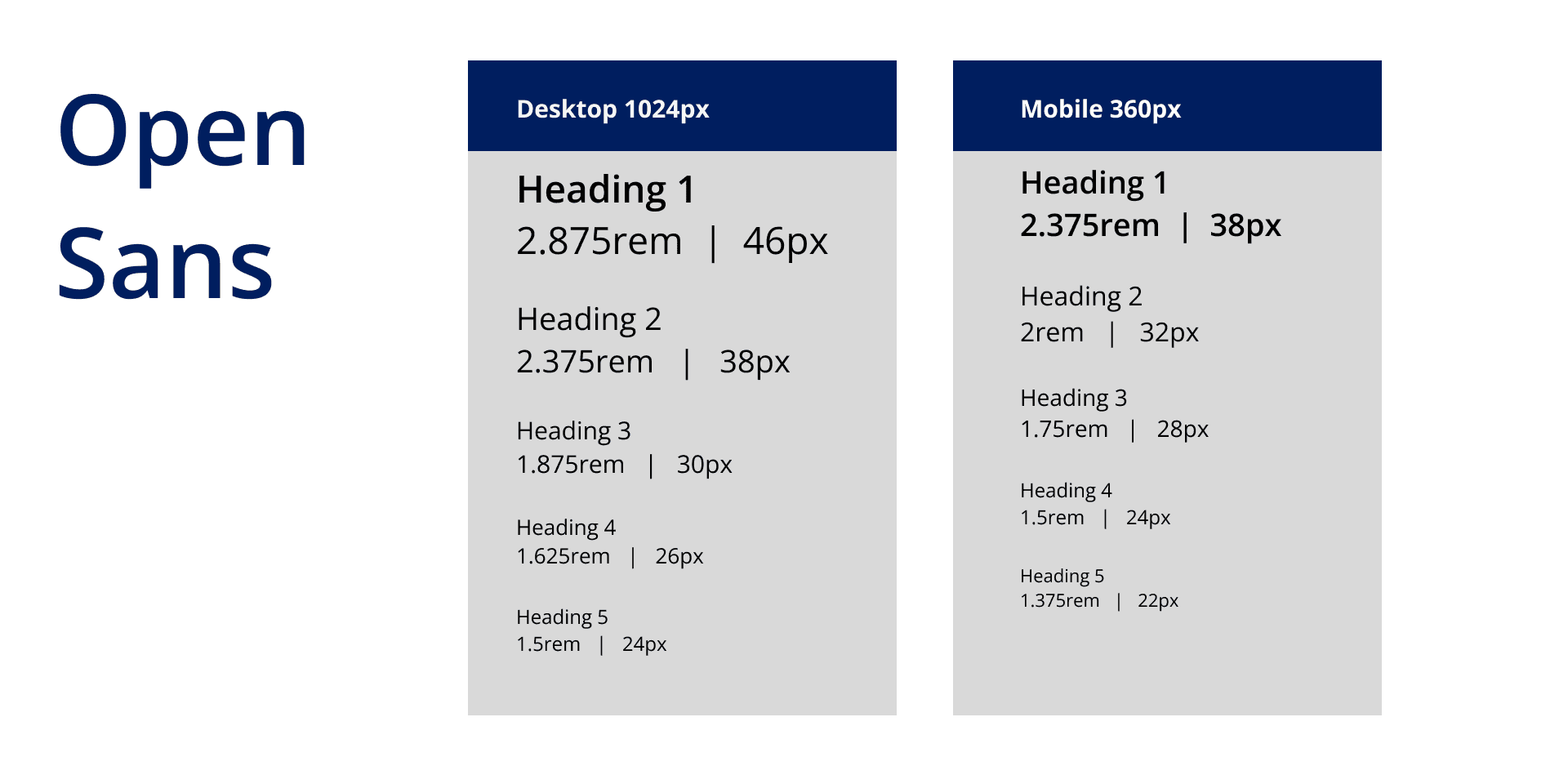
Visual Language & Design System
Selected for its exceptional legibility across screen sizes and strong accessibility credentials. For a rural audience accessing sensitive healthcare content on mobile, a clean neutral typeface reduces cognitive load and keeps focus on the content, not the design.
Brand Colors
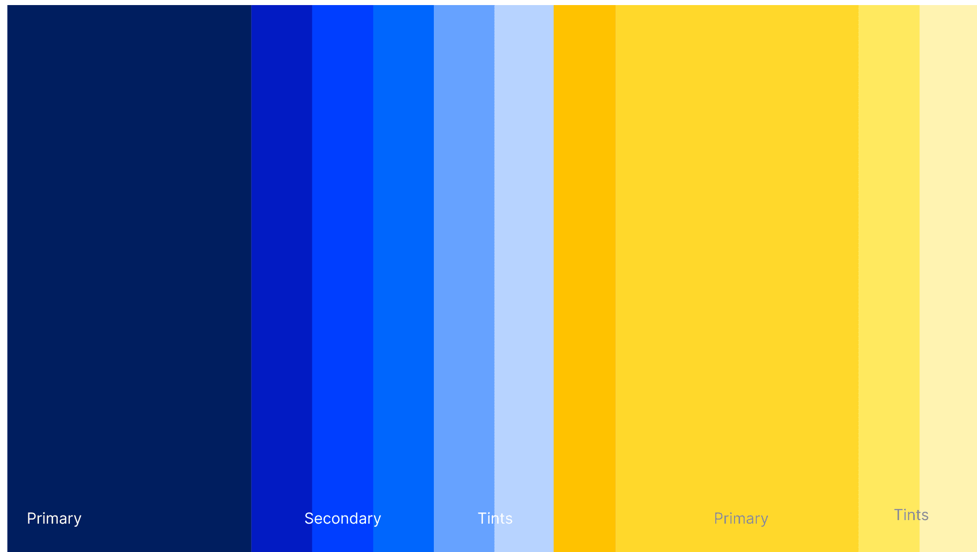
Every color decision followed URMC's official brand standards and WCAG accessibility guidelines. For users in vulnerable moments seeking health information, the design had to earn trust instantly and stay out of the way.
Brand Font
Refinement
The final experience was refined through multiple iterations, focusing on improving structure, consistency, and usability across the platform.
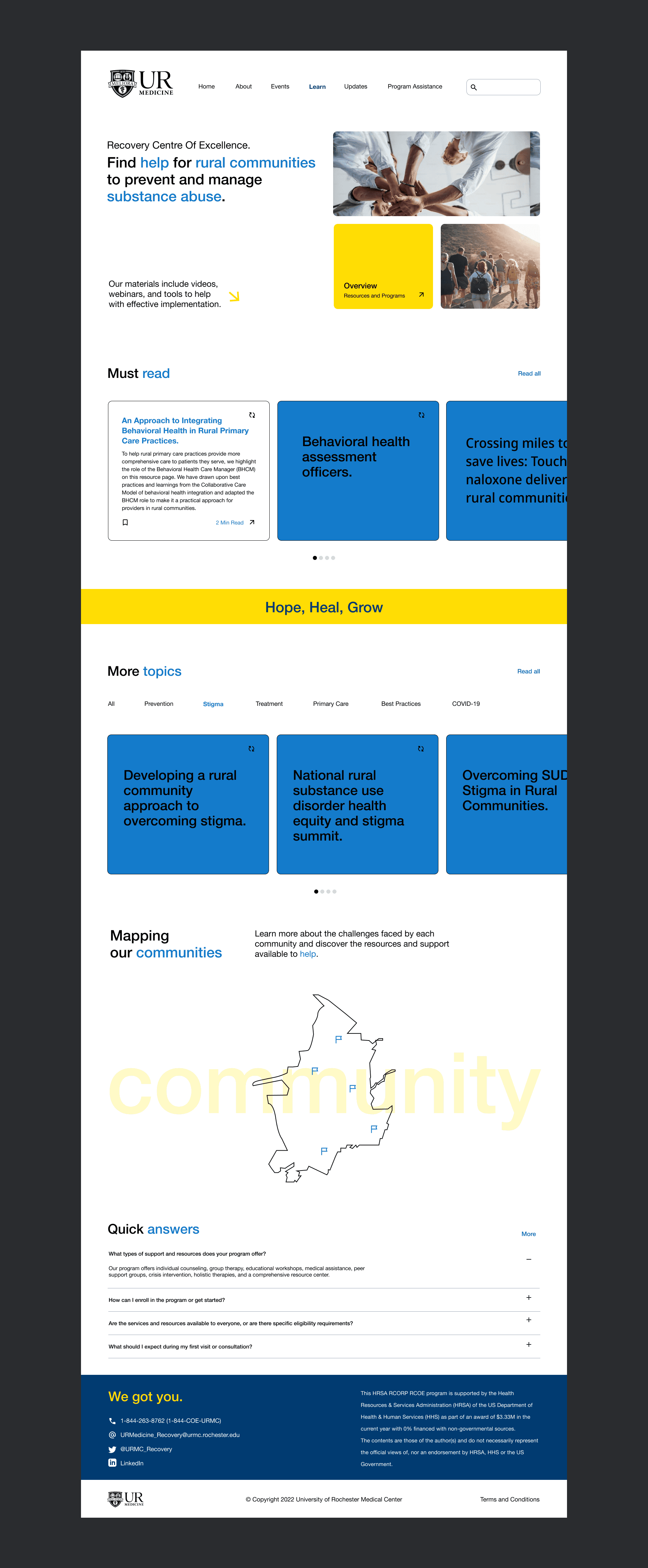
Final Screens
The final experience reflects a series of refinements aimed at simplifying navigation and improving content clarity across a complex system.
Content Discovery & Structured Information
Designed flexible content patterns to improve discoverability, categorization, and user guidance.
📝[ Detailed process documentation including wireframes, design explorations, and stakeholder presentation decks available upon request.]
Business Impact 💡
The redesign aligns with the Recovery Center’s mission to improve access to prevention and recovery resources for rural communities.
By simplifying navigation and improving content discoverability, the platform lowers barriers to information access, supporting higher engagement and more effective resource utilization.
Additionally, the scalable content system enables efficient management of 200+ pages, reducing operational complexity and supporting future expansion.
Reflections
This project was executed within strict institutional design constraints — both visually and in terms of what could be publicly shared. The final direction prioritized clinical credibility and stakeholder alignment over visual expressiveness. As a designer, I saw opportunities to push further, but learned the value of designing within systems that aren't your own — and delivering work that serves the client's goals even when it doesn't fully reflect your aesthetic
Design Vision — If Constraints Were Lifted
Personal design concept — exploring editorial warmth within URMC's brand guidelines
While the final platform was shaped by strict institutional constraints, this concept explores what the experience could look like with full creative freedom — maintaining URMC's official brand system while pushing toward a warmer, more editorial visual language. This direction prioritizes human connection over clinical neutrality, making the platform feel like it was built for people, not institution
Outcome 🏆
Accomplished a complete platform restructure, as measured by consolidating 200+ pages of fragmented healthcare content into a scalable, WCAG-compliant design system, by leading end-to-end UX and UI design across multiple stakeholder review cycles — resulting in a live, publicly accessible experience that makes recovery resources significantly easier to find for rural mobile users, directly supporting URMC's $3.33M federally funded substance use prevention mission.
Live Experience ↓
View the full responsive platform →
Includes desktop, tablet, and mobile experiences.
📝 Confidentiality note: Due to the nature of this client project, detailed process artifacts are not publicly shared. This case study focuses on final outcomes and key design decisions.
Overview
Redesigned a large-scale healthcare platform for the University of Rochester Medical Center’s Recovery Center of Excellence, with a focus on improving accessibility, simplifying navigation, and making recovery resources easier to find and understand.
The project addressed challenges around fragmented content, complex navigation, and low content discoverability, particularly for rural users accessing the platform on mobile device.
Impact
Redesigned a federally funded healthcare platform — supported by a $3.33M HRSA grant — serving rural communities across New York State, a population historically underserved by accessible health information. The existing platform had grown to 200+ pages of fragmented, hard-to-navigate content with no consistent design system holding it together. This redesign was built to change that.
My Role
Lead Product Designer — UX/UI, Interaction Design, Design Systems
I led the end-to-end design of the platform in Figma — owning UX, UI, information architecture, and the design system. I worked alongside a co-designer who handled front-end implementation in Framer, collaborating closely to ensure the design translated accurately from concept to shipped product.
Target Audience
Rural individuals, families, and caregivers seeking recovery-related resources, often accessing the platform via mobile devices with limited time and familiarity with complex healthcare content.
What wasn't working? — Key Observations
Representative examples highlighting key usability and structural challenges across the platform.
Similar patterns were observed across the whole site
Lack of Clear Content Hierarchy
Content appeared as continuous blocks with minimal visual separation, making it difficult for users to scan and prioritize information.
Low Content Discoverability
Key resources and featured content were not visually distinguished, reducing visibility and engagement.
Inconsistent Layout Patterns
Different sections and cards followed varying structures, leading to reduced predictability and usability.
Limited Visual Emphasis
Important content did not stand out, making it harder for users to identify priority information.
Inefficient Scanning Experience
Text-heavy sections and weak grouping increased cognitive load, especially for users quickly browsing on mobile.
Design Direction
To align on the right visual and interaction approach, we explored multiple design directions with stakeholders, focusing on balancing approachability, clarity, and credibility.
The goal was not just visual refinement, but defining a direction that could scale across a complex, content-heavy system.
Each direction evaluated how the experience could:
• Simplify complex healthcare content
• Improve scannability and navigation
• Maintain trust and alignment with a medical institution
• Feel approachable for non-clinical users
The selected direction was refined to ensure consistency across the platform while supporting both content-heavy pages and interactive elements.
Visual Language & Design System
Selected for its exceptional legibility across screen sizes and strong accessibility credentials. For a rural audience accessing sensitive healthcare content on mobile, a clean neutral typeface reduces cognitive load and keeps focus on the content, not the design.
Brand Colors
Every color decision followed URMC's official brand standards and WCAG accessibility guidelines. For users in vulnerable moments seeking health information, the design had to earn trust instantly and stay out of the way.
Brand Font
Refinement
The final experience was refined through multiple iterations, focusing on improving structure, consistency, and usability across the platform.
Final Screens
The final experience reflects a series of refinements aimed at simplifying navigation and improving content clarity across a complex system.
Content Discovery & Structured Information
Designed flexible content patterns to improve discoverability, categorization, and user guidance.
📝[ Detailed process documentation including wireframes, design explorations, and stakeholder presentation decks available upon request.]
Business Impact 💡
The redesign aligns with the Recovery Center’s mission to improve access to prevention and recovery resources for rural communities.
By simplifying navigation and improving content discoverability, the platform lowers barriers to information access, supporting higher engagement and more effective resource utilization.
Additionally, the scalable content system enables efficient management of 200+ pages, reducing operational complexity and supporting future expansion.
Reflections
This project was executed within strict institutional design constraints — both visually and in terms of what could be publicly shared. The final direction prioritized clinical credibility and stakeholder alignment over visual expressiveness. As a designer, I saw opportunities to push further, but learned the value of designing within systems that aren't your own — and delivering work that serves the client's goals even when it doesn't fully reflect your aesthetic
Design Vision — If Constraints Were Lifted
Personal design concept — exploring editorial warmth within URMC's brand guidelines
While the final platform was shaped by strict institutional constraints, this concept explores what the experience could look like with full creative freedom — maintaining URMC's official brand system while pushing toward a warmer, more editorial visual language. This direction prioritizes human connection over clinical neutrality, making the platform feel like it was built for people, not institution
Outcome 🏆
Accomplished a complete platform restructure, as measured by consolidating 200+ pages of fragmented healthcare content into a scalable, WCAG-compliant design system, by leading end-to-end UX and UI design across multiple stakeholder review cycles — resulting in a live, publicly accessible experience that makes recovery resources significantly easier to find for rural mobile users, directly supporting URMC's $3.33M federally funded substance use prevention mission.
Live Experience ↓
View the full responsive platform →
Includes desktop, tablet, and mobile experiences.
More projects


Let's connect! 👋🏼
I’m always excited to collaborate on innovative and exciting projects!
Click to view
Let's connect! 👋🏼
I’m always excited to collaborate on innovative and exciting projects!
Click to view